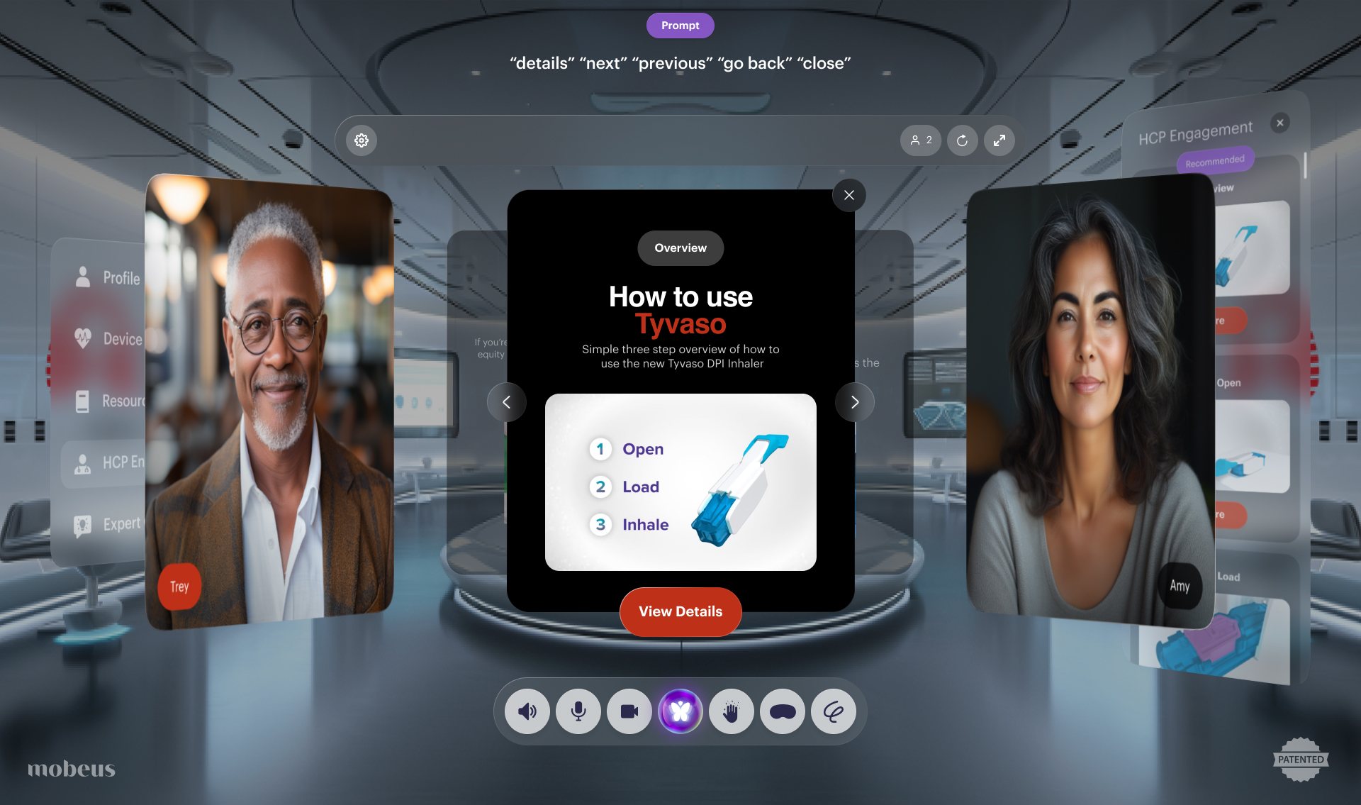
The layout, the glass panels, the dock and its order, the prompt bar, the entry screen, and how content opens and closes.
Case study / Mobeus
Airspace
Mobeus makes Airglass, a platform that puts people in a shared 3D space through an ordinary web browser. There's no headset and nothing to download. The webcam works out where you are and where your hands are, so you can lean in to look around or reach out and move things. I designed the product UI and the spatial design system behind those spaces, and then the client spaces built on it: a retail store for Verizon and a device training room for United Therapeutics.
- Role
- Product UI and spatial design system
- Company
- Mobeus
- Platform
- Airglass, in any web browser
- Scope
- Entry, room, content states, client spaces
- Clients
- Verizon, United Therapeutics
- Input
- Mouse, voice and hands in the air

The United Therapeutics training space, from the welcome screen through the room and its content states.
01
The problem
A 3D room looks great in a demo. The trouble starts when a real person clicks a link and lands in one. They've never been anywhere like it, there's no manual, and they're on a laptop with a trackpad. If the room makes them stop and work out what to do, it's just a slower video call with a nicer background.
The platform could already do the hard technical parts: depth from a normal webcam, hands tracked in the air, media generated while people talk. What it didn't have was a way of looking and behaving that someone could pick up in their first thirty seconds, and that would still hold together when the same room had to sell phones for one client and teach an inhaler for another.
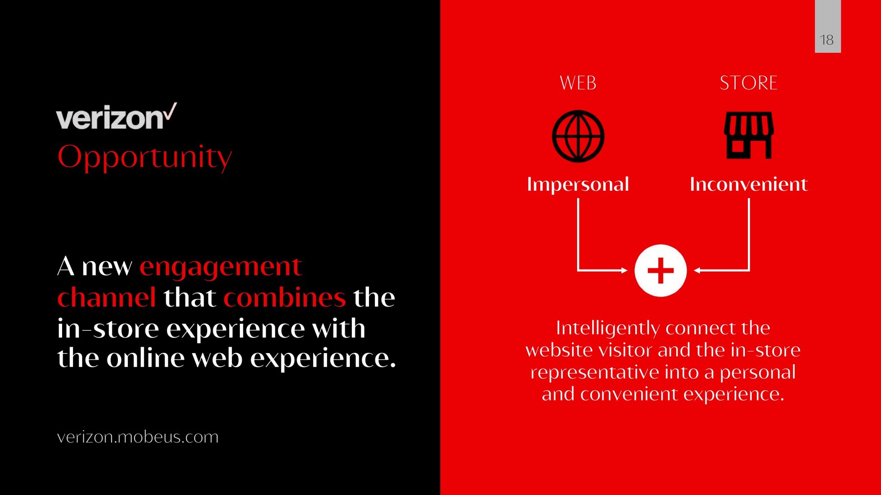
The first client made the stakes clear. Verizon had shoppers on its website with nobody to talk to, and reps in its stores with gaps in their day. The idea was to put the two in the same room. That only works if the shopper, who never asked for a 3D experience, doesn't bounce straight off it.
02
The decisions
Decision 01
Borrow the spatial rules, keep the point-and-click habits
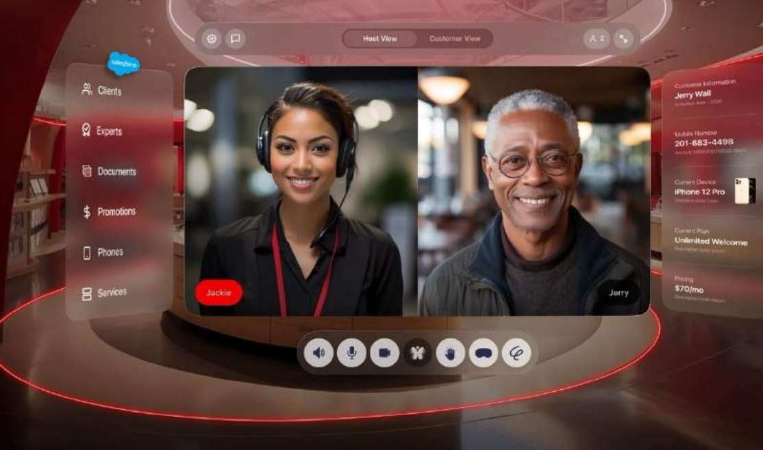
Apple had published its spatial design guidance for Vision Pro, and I used it as the starting point: frosted glass panels with real depth, soft rounded shapes, and content that floats in front of an environment instead of sitting in a box. But our users were on laptops, not headsets, so anything they already knew from the web stayed. Buttons look like buttons, menus sit where menus usually sit, and you can do everything with a mouse.
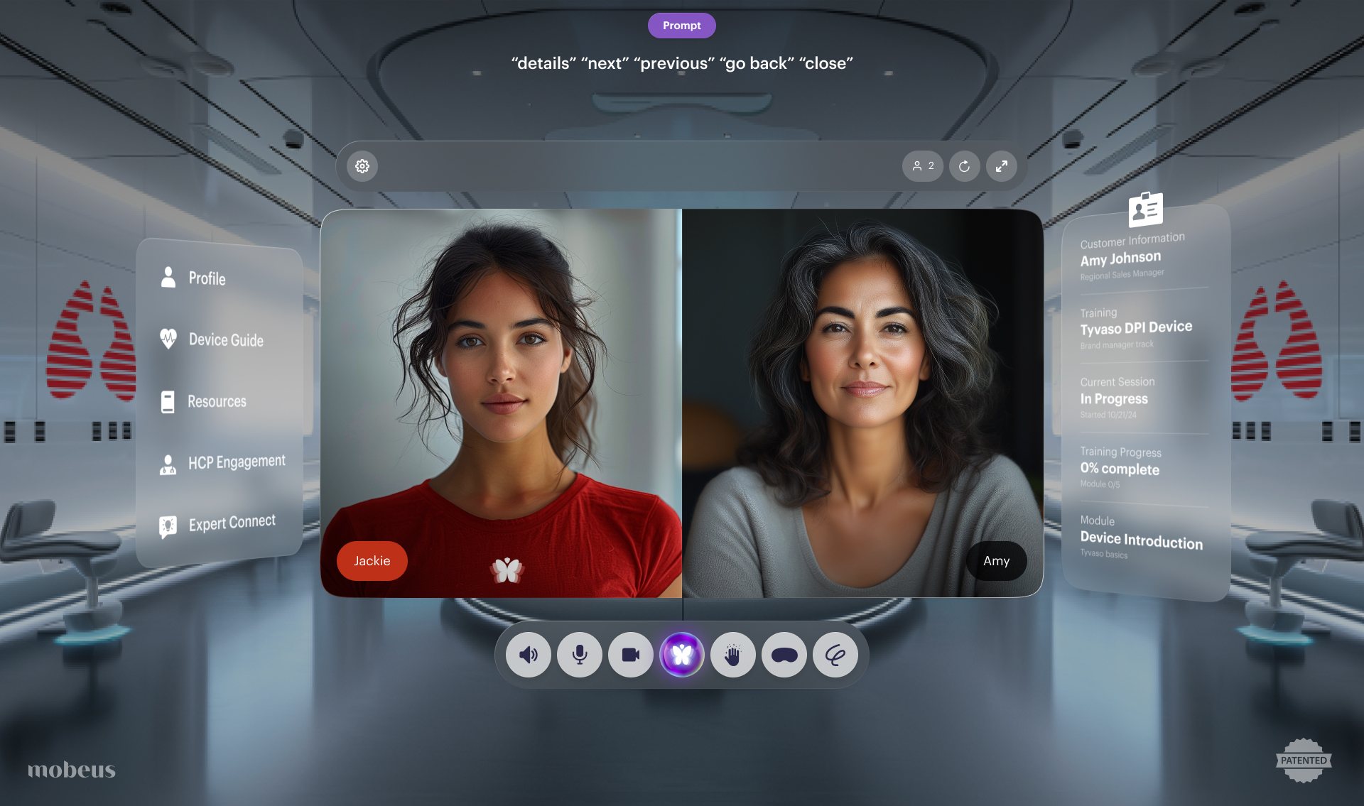
The layout of the room came out of that. Everything has a fixed place: the people in the middle, what you can open on the left, who you're with on the right, and one row of controls along the bottom. Learn it once and you know every space built on it.
- 1 · Prompt bar
The words you can say right now. It changes with whatever is on screen.
- 2 · Room controls
Who's here, refresh the space, go full screen. Settings on the far left.
- 3 · Modules
Everything you can open in this space, as one short list.
- 4 · The people
Always in the middle and always life-size. This is a meeting first.
- 5 · Context
Who you're talking to and where they are in the session, for the host.
- 6 · The dock
Sound, mic, camera, hand tracking and the rest, in the same order in every space.
Decision 02
Make the way in a single step
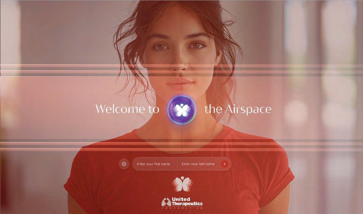
Anyone arriving from a link gets one screen and one question: their name. There's no account to create, no app to install and no camera setup wizard. Type your name, press the arrow, and you're in the room.
The butterfly in the middle doubles as the loader, so the few seconds it takes to build the space read as part of the welcome instead of a spinner. And the screen carries the client's brand, not Mobeus's. Someone joining a United Therapeutics session should feel like they've arrived somewhere United Therapeutics made.
Decision 03
Keep the people in the room when the content arrives
The usual move on a video call is to shrink everyone to thumbnails the moment somebody shares a screen. It's efficient, and it turns a conversation into a presentation. In a space that's meant to feel like being in the same room, that was the one thing to avoid.
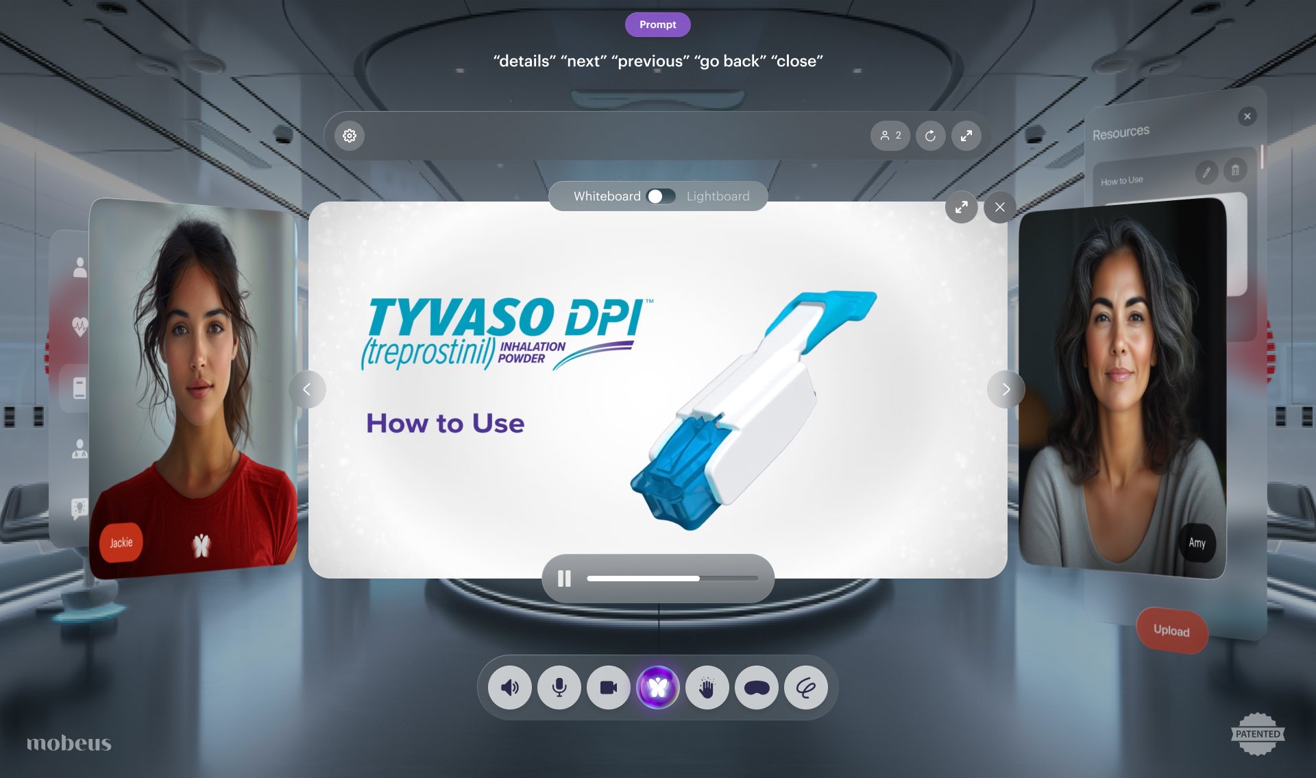
So when a video, a device guide or a quiz question opens, it takes the centre and the two people swing out to either side, angled toward it like two people standing at a counter. They stay full size and you can still see their faces react. Close the content and they swing back.
Decision 04
Give the host the notes, not the guest
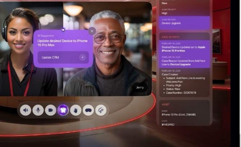
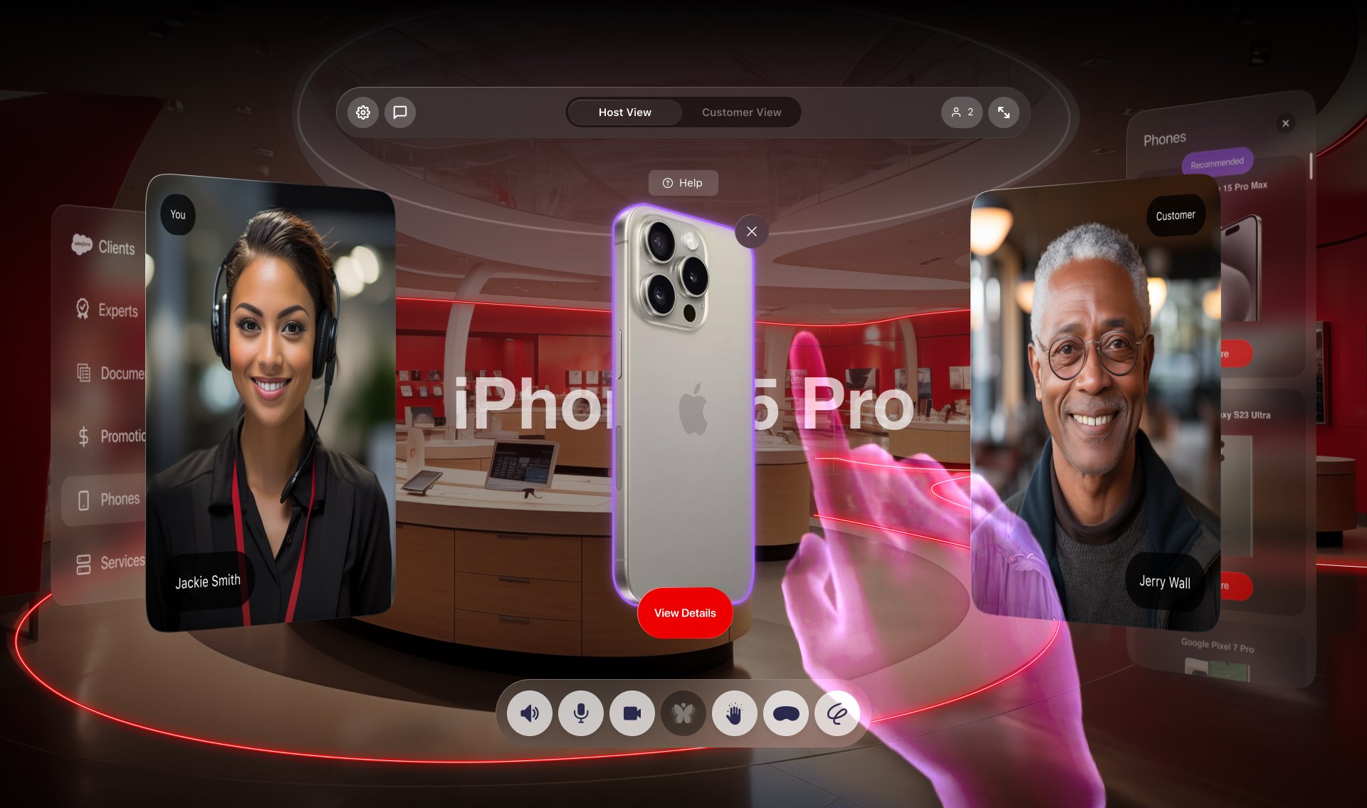
The two people in the room need different things. The customer needs the product. The rep needs to know who they're talking to. So the context panel on the right is for the host. In the Verizon store it pulls the customer's Salesforce record: case history, current device, plan and what they came in wanting. In the training room it shows the trainee's module and how far through it they are.
The AI suggestions live there too. When the conversation turns up something worth recording, like a customer settling on an iPhone 15 Pro Max, a small card offers to update the CRM. One click, and nobody has to stop talking. A Host View and Customer View switch at the top lets the rep check exactly what the customer can see.
Decision 05
Show every command, whichever way you give it
The room takes voice, hands in the air, and a mouse. The risk with voice and gesture is that nobody knows what they're allowed to say or do, and they won't guess. So the prompt bar at the top lists the words that work right now, like "details", "next", "previous", "go back" and "close", and the list changes with what's on screen.
Every one of those commands is also a button. Hand tracking is a toggle in the dock, not a requirement, and nothing in the room can only be reached by waving at it. The gestures are the part people remember from the demo. The buttons are why the demo works for the person who has never tried it.
03
One system, many spaces
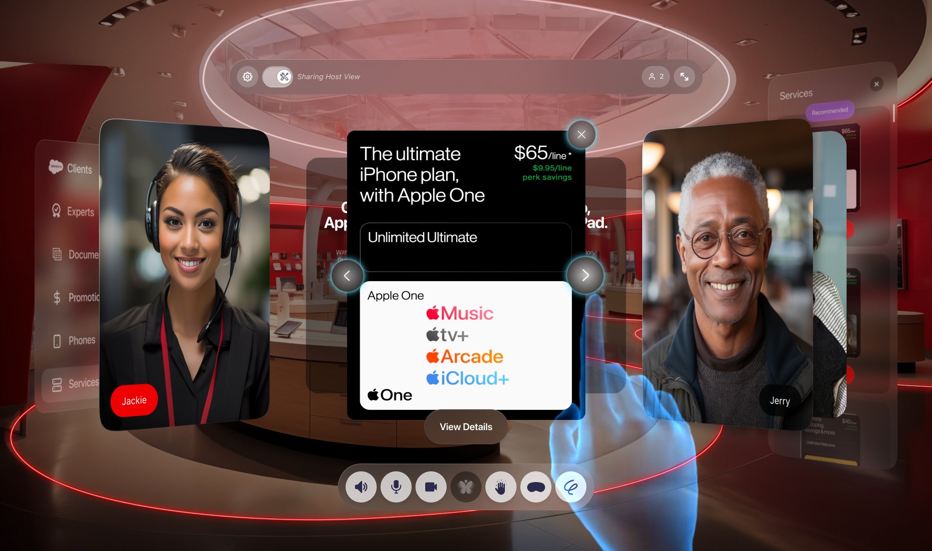
Every client space is the same room underneath. I built the glass panels, the dock, the prompt bar and the content cards with all their states as one system, then decided what a client is allowed to change: the environment, the brand color, the modules on the left, the fields on the right, and the content itself. Everything else stays put.
Put the Verizon store next to the United Therapeutics training room and they look like different products, a red retail floor and a quiet grey clinical suite. But a host who has run one could run a session in the other without being shown how.
Stays the same in every space
Changes for each client
The environment, the brand color and logo, the modules on the left, the fields in the context panel, and the content people open.
04
How it landed
Verizon Airstore was the first space built on the system, as a proof of value for connecting website visitors with in-store reps. The business case Mobeus modelled with it used Verizon's own footprint: 6,500 stores, two reps each, and 5 percent of their time adding up to about 7.2 million sessions a year. At a 1 percent conversion to a new line, that comes to roughly $145 million a year. The deck is clear that it's a simulation that still needs refining, not a result. But it's the argument the space was designed to make, and the design had to hold up while someone made it.
The United Therapeutics room took the same system into life sciences. It's a 28-screen flow for training sales teams on the Tyvaso DPI inhaler, from the welcome screen to a five-question knowledge check, with Expert Connect for bringing a product training lead into the room when the content runs out of answers.
Mobeus has since pointed the same platform at AI, with generated agents it calls teles taking the host's seat. What I took from it: new technology usually gets one chance with people who didn't ask for it. The job was to make the room feel familiar enough that nobody noticed how new it was.
- Step 1 · Welcome
One question, your name, and you're in the room.
- Step 2 · The room
Host and trainee side by side, with the trainee's module and progress on the right.
- Step 3 · Device guide and resources
Recommended material opens as panels, and anything can be shared into the middle.
- Step 4 · HCP engagement
Open, load, inhale. How to walk a physician through the device, one card per step.
- Step 5 · Knowledge check
Five true or false questions, answered by voice or by tapping.
- Step 6 · Expert Connect
A product training lead joins, with their expertise and history in the side panel.
28Screens in the training flow
2Client spaces
3Ways to give a command
0Headsets or downloads